
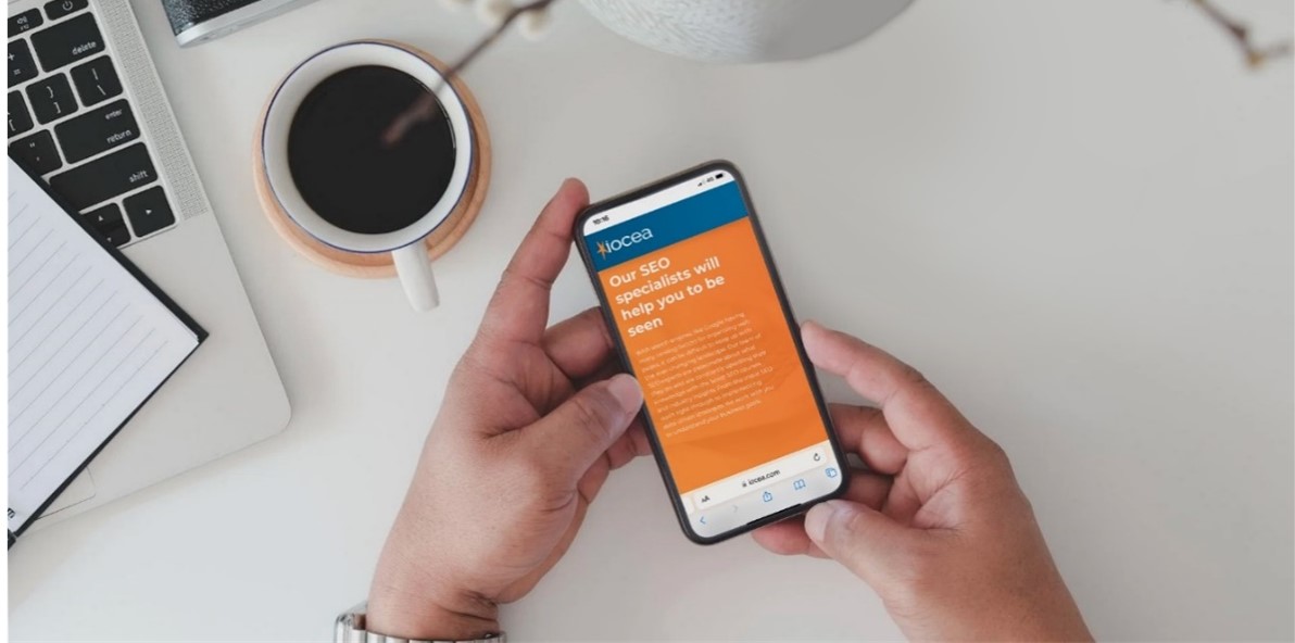
How To Make Your Website More Mobile Friendly
Always think mobile-first…
Over the last 20 years, the world has revolutionised itself into what we all know today. Electric cars are becoming the new must-have, houses are being developed with electric charging points and companies are beginning to trial drone deliveries to customers. This major evolutionary change hasn't gotten in the way of the world of eCommerce, if anything it has boosted it causing a domino effect of new ideas and developments coming into play every day.
Before you even create your website, always think
mobile-first with the planning and development. With today's users spending on
average 5 hours a day on their smartphones generating around 70% of web
traffic, if you want your business to succeed online then this article will be
your best friend.
With data usage expected to grow by over 40% on mobile phones by the end of 2022, don't get left behind! In this useful guide, we will give you the tips and knowledge you will need to create your own great webpage.
In this useful guide, we will give you the tips and knowledge you will need to create your own great webpage
What is a mobile friendly site?
A mobile-friendly webpage that represents a site that is designed to be viewed on both smartphones and tablets. The website design has been created in such a way to be viewed on smaller screens, as well as every part of the website being accessible for mobile devices. As well as being accessible, it also has to load quickly for the user as this will be loading from 3G or 4G networks rather than home WiFi.

Our top tips to make your website more mobile friendly:
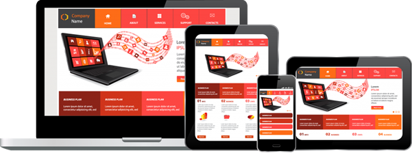
Implement a responsive layout
When designing your website, it is of utmost importance that you ensure it works first on mobile. Mobile and tablet screens are significantly smaller than desktop screens so the information you have within your webpage needs to be seen on a mobile but not be too compacted with text. Mobile and tablets can use touch rather than clicks. As mobile users generally want to find something quickly, buttons within your webpage need to be accessible and easy to click on to take you elsewhere within the webpage without fault. Another thing to think about when designing your website, do you want the layout to be identical on desktop, mobile, and tablet? For continuity, it may be a better idea then users can guide their way easily through the webpage regardless of what device they are using.
Mobile friendly pop-ups
Nobody wants to be in the middle of reading something on your webpage and then a giant pop-up appears that they can't get rid of. If you do want a pop-up to appear on the mobile site ensure that the user can easily click off it, without having to zoom out or change the page orientation. If you have a pop-up on a mobile that requires the user to enter any details, make sure there is a visible box to enter the required details, that is easy to click on and type within. If the pop-up isn't mobile-friendly users do get bored and won't often persevere with filling out the required details, meaning you may have lost someone signing up to automated emails or from travelling through the website to check out their order.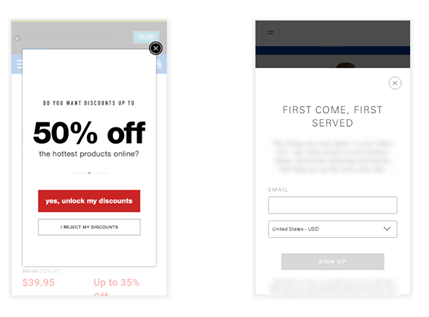
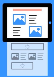
No shifting elements
How annoying is it when you go onto a webpage and all the images suddenly load and shift on the page randomly? It can make you lose the place you were viewing on the page. The best thing for this is ensuring your images are loading 'lazily' meaning they will only load at the page the user scrolls down, as on certain web pages the customer has already found what they need just from looking at the home page, there is no point all the images loading as they may not be relevant to the website user and just take up unnecessary time to load. Images and videos can take up lots of unwanted space on your webpage, in turn, if you have lots of images on your site the site speed can be massively affected by this, and if mobile users can't easily access and load your page they will soon get bored and leave it without viewing any content or making a purchase.
Touch points
Touch points Mobile sites give you a way of interacting with a site using the following main features: Touch, Location, Page Orientation, Video/Image upload straight from a mobile device, and Swiping/Zooming on the webpage. Something to consider when designing a webpage suitable for mobile is where the touchpoints will be on the screen. Don't forget a mobile phone is a lot smaller than a desktop, so the touchpoints need to be big enough to be visible but not take over the whole page. Mobile users want quick answers, if you have a contact number for your business on your webpage a useful function to have would be a Call to Action button so that the mobile user can dial straight from their phone easily as well as have the ability to pay for orders via mobile payment if customers can complete checkout quickly on your website the better for everyone.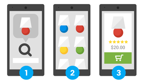
Focus on website speed optimisation
With so many things to consider when creating a mobile-friendly website, you also need to consider the website speed and how to optimise this. A few things to take into account when trying to increase the page speed can be things such as reducing redirects, every redirect is an additional waiting time for your user, optimising images is another useful tip by ensuring that your images are the correct size that they should be, they will load quicker on the page so there will be no delay. Try to limit the number of videos you have on your webpage, as this again will slow your page down dramatically as it will be trying to load the video to play all the way through. To also ensure people are searching for your webpage, they may try key terms or phrases, by having these phrases within your website will ensure you are seen by more people and in turn, you will be higher up on the search page on Google, which means lots more clicks onto your website!

How Our Website Development Specialists Can Help

We create exceptional eCommerce websites, our specially designed Cshop platform has been delivering class-leading eCommerce solutions to small, medium and large businesses since June 2000. We work closely with our customers to deliver feature-rich products that maximise multi-channel sales by implementing the best technology along with our own in-house developments. With new technology being added to Cshop on a daily basis you can benefit from all the latest ideas and knowledge we have within the industry. So what are you waiting for, get in touch with us today…