Effective User Experience Tips
User experience is the back bone of product design, whether the product is a website, mobile app, or something else. While it should be obvious that UX is essential to product design, some UX designers still have a lot of misunderstandings about it.
But the fact is that if your UX design works with your target audience, your product flourishes. If you don’t even know where to begin, don’t worry - this below guide covers the essentials of getting the User experience design process first time! These tips will most definitely help you figure out the best ways to become a better UX designer.

User Engagement
UX design is all about engagement. Engagement is one of the most important elements in web and app development. But User Experience designers often fall into a trap of trying to fix what isn’t broken.
There is a reason most websites and mobile apps are structured the way they are — it works. Users have become accustom to how websites are laid out on their screen. Why change the habit of a lifetime? Most don’t like adapting to something different. Often the desire to change the design of a webpage leads to off-putting fonts, colour schemes that do not work as well as confusing navigation within your website. Usually it is a case of all the best intention, however this can often lead to engagement on your site to drop.
This is why it is better to use tried and tested layouts throughout your website with minimal tweaks to fit the goal you are trying to achieve. Call To Action (CTA) buttons and ‘Products you may be interested in’ are a great way of enticing users onto your website. By using this approach it makes users totally familiar with your website and allows them to use it with ease. Sticking to those tried and tested patterns saves your creative mind for when design innovation really matters.
Responsive Design
Another big problem that often occurs in the User Experience design process is when things are far too complicated for the user. The tried and tested patterns are there, but when designers overcomplicate the design these patterns become far too much which then leads to a design that just doesn’t work.
When a design is ‘too much’ this is an instant shut off for user experience. When the user gets to a page that is incredibly text heavy or has distracting functionality the end result is generally the user exiting the site which is the complete opposite of what you are trying to achieve. You are always best to keep things user-friendly as your main goal is to keep the user’s focus on your website. Each page needs to have a single definitive purpose.
For example, the contact page must just contain contact details and/or a form for users to fill out. As well as having a definitive purpose, each page and component within that page needs to be understandable for clear usability.

Ensure different elements are distinct
Having a page with a distinct layout is one of the main goals for a UX designer, it is a great way of maintaining a user friendly journey as wellbeing engaging. It is always great when you don’t have to think about how to find something without an issue.
Below are a few handy things to remember -
- The most valuable information on the page needs to stand out the most. If you have a blog post on your page you need to ensure a clear headlike followed by a subheading that goes further into detail about the subject.
- The search field needs to be clear on the page, even using the word ‘search’ within the box. On most websites the search function is at the top right corner of the webpage.
- Action buttons must stand out and include a clear description of their purpose. For example, a subscribe button with a field that you can type in your email.

And when it comes to colours, it's important to be aware of the following general rule:
- Blue should be used for text links.
- Red is for the important stuff — typically alerts or errors.
- Calls to action require a high-contrast, often exclusive colours are used to stand out from the rest.
Maintain Consistency, Always
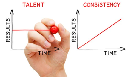
Consistency is one of the most important aspects of user experience, this all helps with the continuity of your users journey. In design terms, flow on your website is so important, this is when the user journey from one section of the website or mobile app to another is seamless.
A consistent design scheme helps users to get what they want and need smoothly which works to your benefit, this keeps users on your website longer because everything is so natural. To keep things consistent, you need to think through what the user is going to do step by step. The user starts their journey at an entry point which is usually the homepage or a blog post. You need to think where that entry point is going to lead the user to. It may lead to another blog post that expands on the subject they are looking at or a page offering some service or product that answers the user’s needs.
Whatever this may be, it MUST be consistent. The other thing to consider is dead-end pages, those pages that don't lead anywhere else. These need to be avoided as much as possible so that users do not get bored on your website, every page must lead to something!
